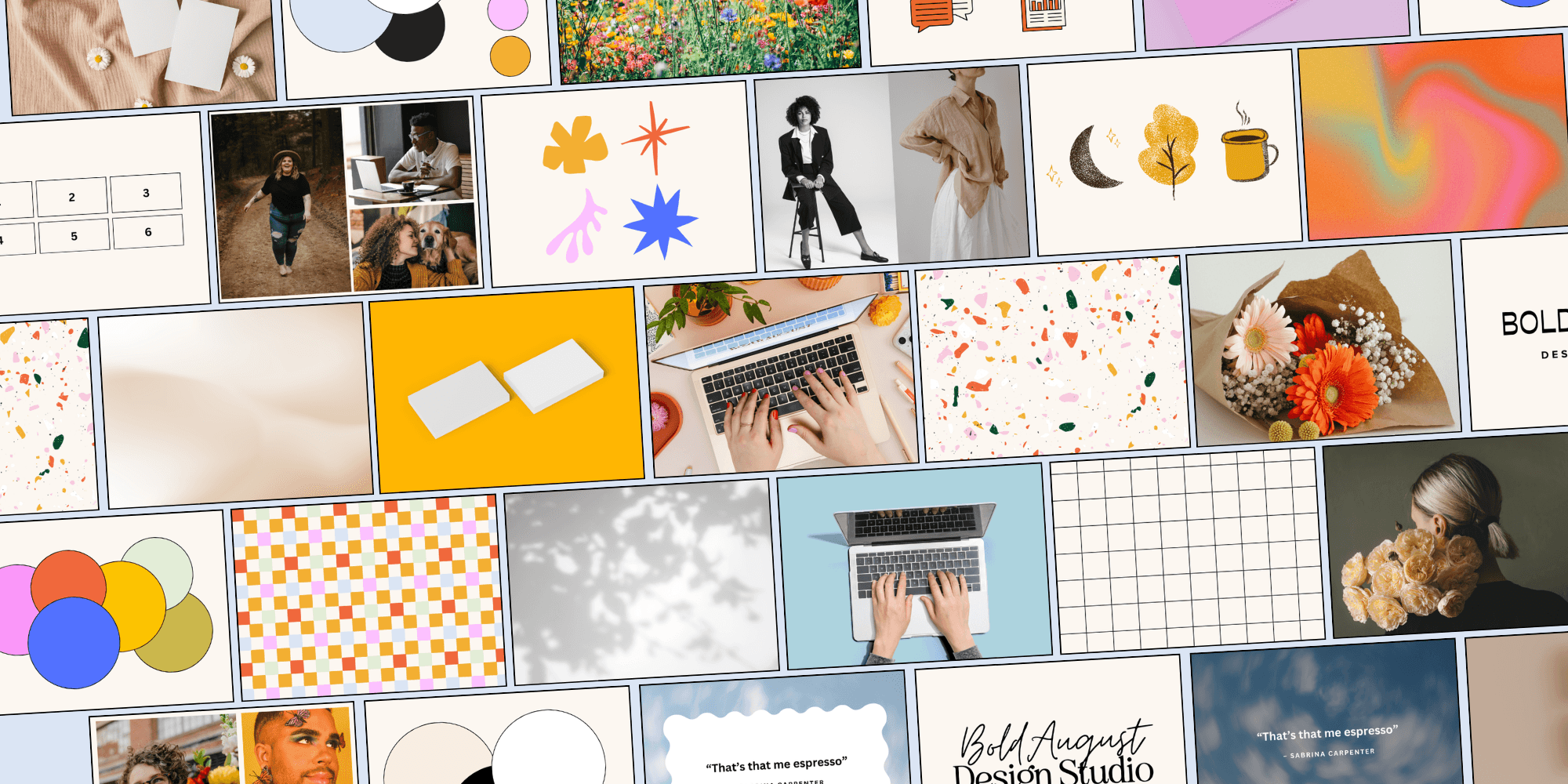
Not Another Brand Personality Quiz: Brand Profiles with FREE Canva Templates
Have you ever said "I just don't know how to describe the designs I want in my head"? If so, this is the quiz for you!
This Brand Personality Quiz from Bold August will not only give you a brand asset profile, but will also teach you design vocab so that you can communicate with your designer more easily! No more "I can see it but not describe it" – after this quiz, you'll basically speak designer!
1: Let's start with a collection of words.
*
When thinking about your brand, it's helpful to begin thinking in concrete terms so you can plug those terms into Pinterest to get your brand personality.
2: What types of colors do you like?
*
Now we're not talking about amount, we're talking color profiles. You'll notice I'm using words like accent, neutral, vibrant, cozy, etc.
3: What business card mockup do you like the best?
*
A mockup is when you place a design in a real-world scenario. If you "mocked up" your business card, what style would you choose?
4: Choose a script font combination!
*
If you HAVE To choose a font combo with a script font, which would you choose?
5: What border / text container do you like the most?
*
Text needs contrast to be easily readable! A great way of adding contrast is to add a text border or change the image opacity. What looks best to you?
6: What gradient would you choose?
*
Gradients are a great way to add depth and movement to a section or brand. They come in all types of colors and flavors - so what strikes your fancy the most?
7: Choose a stock photo of a computer.
*
Maybe it's for a blog post or a section about your services - which stock photo do you choose?
Which one of these sets of flowers speaks to you the most?
9: What icon style would you choose?
*
Icons are amazing for lists or to illustrate statements. They can help "show" and not "tell" certain concepts.
Q9: Icons and Graphic Style
11: Choose a texture for your brand.
*
Textures, like gradients, are a great way to add a little spice to your brand. Whether it adds movement, depth, or a tactile feel, they're great brand elements.
12: What style of headshot do you like best?
*
Oh man, the headshot! What to wear? How to pose? I find that these four styles show up most often in headshots. Mine is the one with flowers!
Why? Well, we need a pattern of course, and a grid is a great way to see the differences between the feel and vibe of patterns!
That's it! You've done it: you've cracked the code of your design profile. You've connected design vocab with visuals, and have a better understanding of design elements.
Enter your email and click "Submit" to receive your results!


